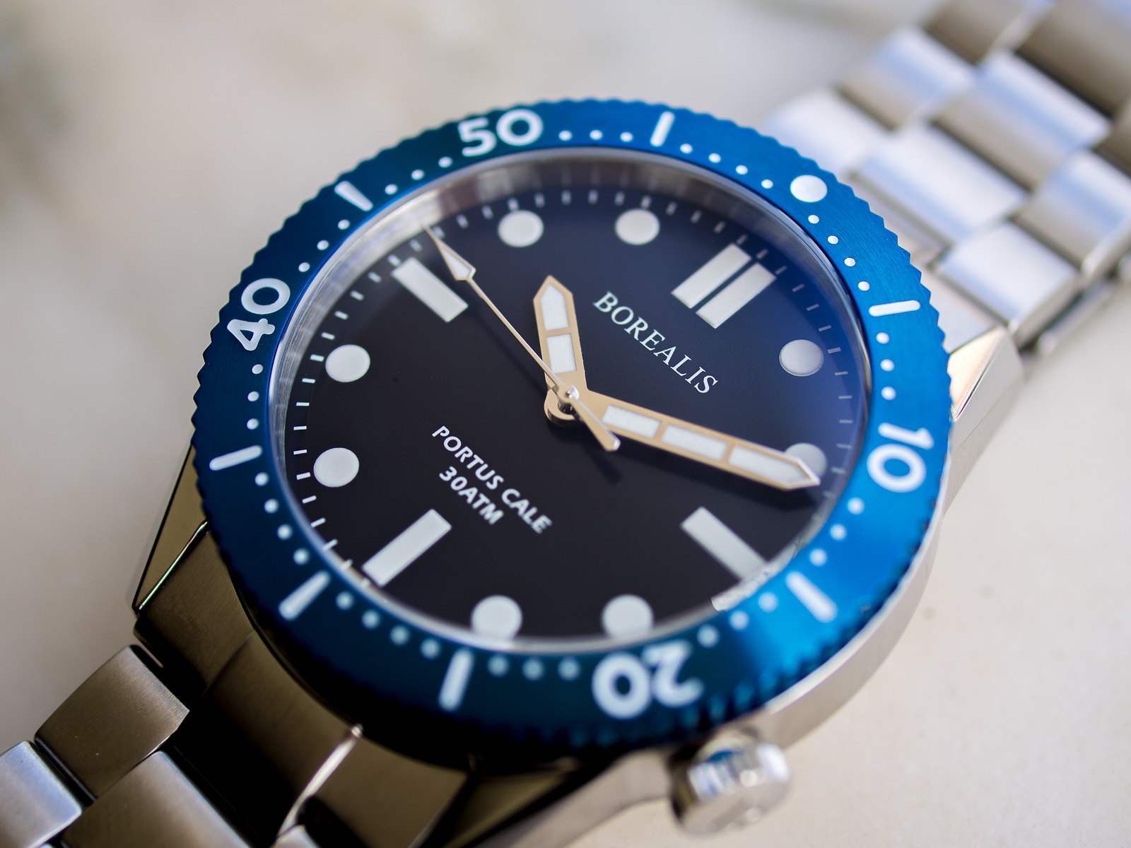
Pre-Order Borealis Portus Cale
- Thread starter sapcmc
- Start date
SuperP
Perfect Apprentice WIS
Looks really nice Carlos, ill keep an eye out for this one.
Just a small suggestion if i may. Some texts/fonts and Borealis logo to me, personalty need a bit of work, to make you watches stand out even more. When the first renders came out, since i really like this watch, i've draw something and created some logos. Hope you dont mind the suggestions, just my two cents. Keep up the good work.
Best regards.


SimpleWatchMan
Master WIS
Very nice. I assume 42 mm case size?
Peter van Geresteijn
Master Apprentice WIS
What a beautiful watch! Would love to see the pictures of the other models, very interested in the white one as well.
Just a question: what is the consideration for not adding chromed borders around the lumed dial inidices?
Just a question: what is the consideration for not adding chromed borders around the lumed dial inidices?
Because I like it this way and lume is stronger. Really if all watches had chromed borders designs would be similar and similar.What a beautiful watch! Would love to see the pictures of the other models, very interested in the white one as well.
Just a question: what is the consideration for not adding chromed borders around the lumed dial inidices?
Peter van Geresteijn
Master Apprentice WIS
Better lume is always good! Can you share some pictures before the pre-order starts that show the 'depth' of the dial? I love depth on watch dials and fully printed dials often look too flat for my taste (for instance the Squale 1521).Because I like it this way and lume is stronger. Really if all watches had chromed borders designs would be similar and similar.
SimpleWatchMan
Master WIS
Is the white dial C3 X1 lume bezel dark grey in colour?


